Oil Recover Factor vs Reservoir Compliexity Index (RCI)
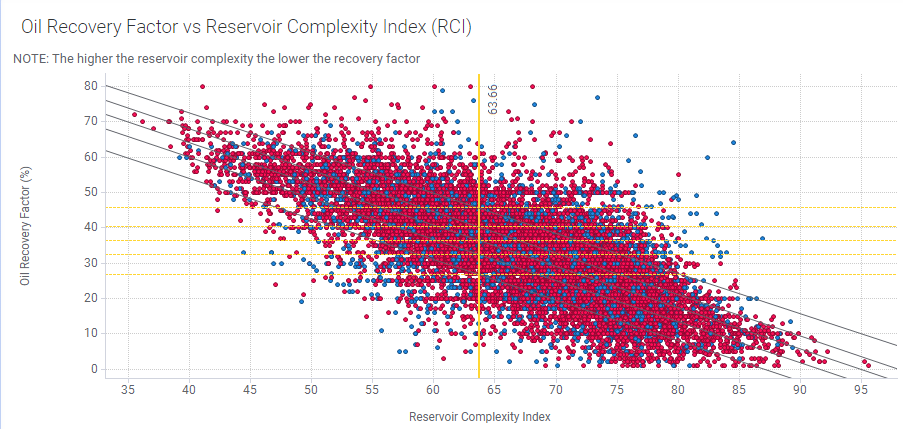
The upper left scatter plot is the Oil Recovery Factor on the y axis plotted against the Reservoir Complexity Index. The red dots are the training data, and the blue dots, the test data. Each dot represents a reservoir. Notice there is a tight correlation between the 2, but in this case, some outliers etc indicate no over fitting or under fitting. See Prediction Algorithms & Settings for a description of over fitting and under fitting.
The plot trends down from left to right indicating, logically, that the smaller the complexity index, the greater the oil recovery factor. The 5 lines running through the plot are the percentiles, from bottom to top, P10, P25, P50, P75, and P90. Correspondingly, the horizontal yellow lines are the Oil Recovery Factors for each percentile. Hover over an item in the plot to see the values. In this example, the RCI for this reservoir is 63.66.