Factor Contribution Analysis
Factor Contribution Analysis (FCA) allows analysis of individual wells. FCA generates 2 sets of visualizations:
-
FCA Scores —shows the individual FCA scores per attribute and derives trends. the horizontal line represents the average.
-
FCA - Visualization—shows the impact of these attribute scores on the performance of individual wells enabling you to analyze and compare individual wells with under-performing or over-performing wells.
Unlike regular model training process where we do a train/test split to validate model performance on unseen data, our factor contribution score is calculated from a model trained on 100% your dataset. Our technique aims at explaining dataset feature interaction by analyzing the predictive model trained on it. Therefore we use the entire dataset for FCA model training, since it would capture all possible interactions and produce the best data explanation. Of course this could lead to model overfitting which, in turn, could diminish model reliability. We would suggest that you carefully select model hyper parameters to avoid overfitting before running FCA.
The first image below is the FCA Scores, scatter plots showing the contribution of an input attribute (y-axis) on a model versus the input attribute's values (x-axis).
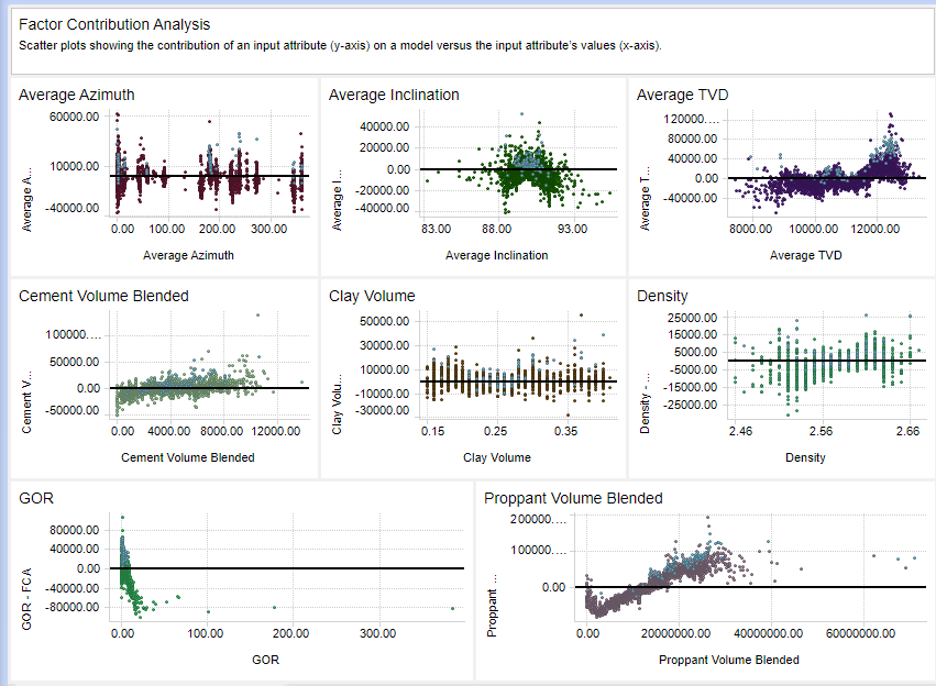
The last plot, Proppant Volume Blended, clearly shows a positive relationship between proppant volume and its influence on production.
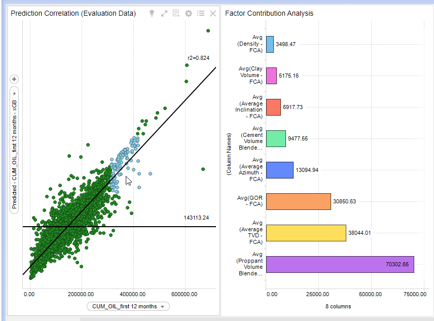
The next 2 images show the FCA - Visualization charts. Note that you can select (mark) single or multiple wells in the scatter plot on the left, and see how each of the input variables affected production on the right. In the first image, the lower producing wells are selected. The bar chart on the right shows that the average proppant was the input variable that most affected these under-producing wells. The next image has the higher producing wells selected. Again, proppant seems to be the highest contributing factor.

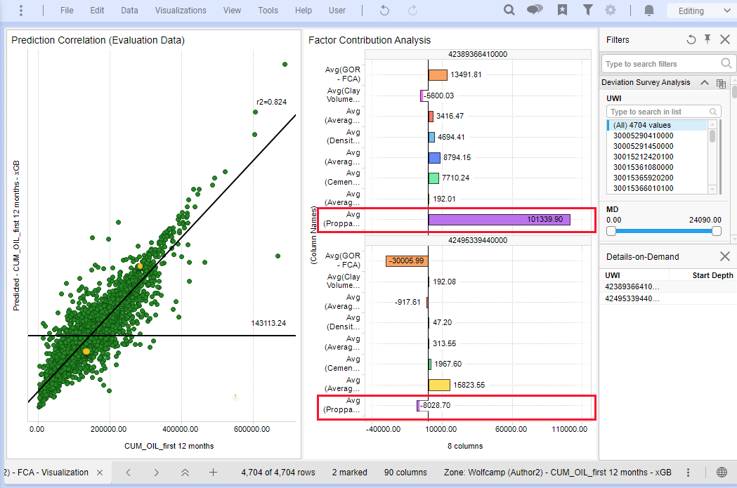
You can also modify the bar chart view to compare 2 wells: one under-performing and one over-performing. In the image below, the 2 wells being compared are the yellow dots on the left. The over-performing well is above the horizontal (average) line and the trend line, and the under-perfroming isabove both. On the right the top bar chart is the over-performing, and the bottom the under-performing. The most pronounced difference is the average proppant, outlined in red below.
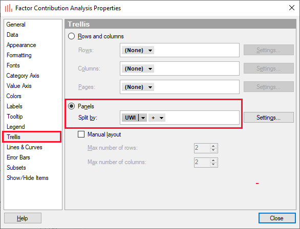
To create this split (trellis) view:
-
Select the wells you want to compare in the scatter plot using the Ctrl key
-
Right-click in the Factor Contribution Analysis bar chart and select Properties
-
In the Properties dialog select Trellis.
-
In the Trellis panel, select Panels and Split by the unique identifier, in this case UWI. See the image below.