Golden horizon example
Golden is a Kingdom project with seismic data, both 2D and 3D, and interpreted horizons. Seismic volumes were generated using various tools in Kingdom. The project has no well data. The following images were taken from the Cluster Analysis feature in Analytics Explorer. Each visualization is briefly described to illustrate the power of the AE tools.
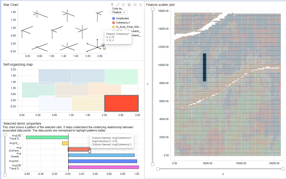
Cluster Analysis creates 4 visualizations: Star chart, Self-organizing map, Item properties, and the Scatter plot. Six horizons (features) were selected for analysis, each based on a distinct seismic data type. Yellow lines point out the channel in dark blue in the scatter plot. The yellow lines were added for illustrative purposes only. All visualizations are connected. Select a scatter plot cell and view the cluster cells and bars on the other visualizations.
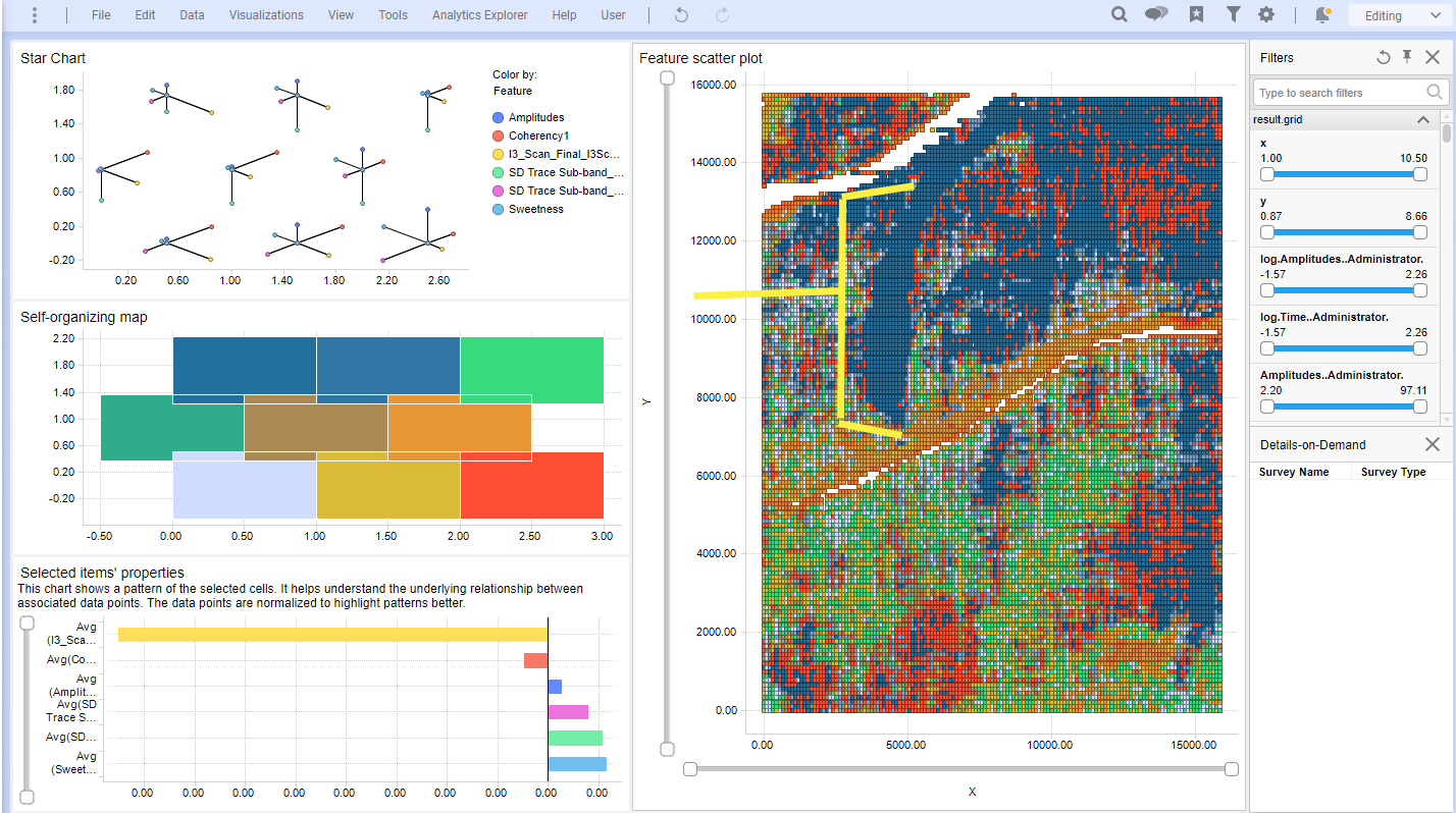
In the image below, a group of cells have been selected from the channel in the scatter plot. Note that this scatter plot has XY location coordinates as its axes. The selection of the cells in the channel activates the corresponding clusters and bars. You can see in the Star Chart that a single node is active, indicating that all selected cells (and likewise much of the channel itself) share the same relative attribute values. The hover over on the star chart displays the XY cell id of the selected attribute, in this case Coherence1.
The normalized value of the attribute is shown in the Item Properties bar chart, in this case, 0.32. Note that this value is only to display the relative value. For example, a negative value does not mean that the actual value is negative. Rather, it is small in relation to the other normalized values.