How to use the Histogram Module |
|
The Histogram Module displays a histogram of log curve values. Put another way, the histogram visually shows the distribution of log curve values without respect to depth. These values can be limited to a specific depth or zone, or filtered by up to three separate discriminator log curves. Opening the Histogram ModuleOn the Main Module, select Tools>Log Histogram from the menu bar at the top of the screen. Alternatively, select the
Loading/Saving settingsTo load or save histogram settings, select File>Load Settings or File>Save Settings on the menu bar at the top of the screen. Saving these settings creates a *.HS file that retains the selected curves, scales, and histogram settings. The Histogram Module looks at the log data stored inside the projects database, so the data is always live. Changing the curve data will change the appearance of the histogram, even after loading old settings. Selecting WellsIts often useful to only work with a small subset of wells in a project. The Histogram Module can select wells in a few different ways available from Wells>Select on the menu bar at the top of the screen. All Wells selects all wells available in the project. By Data Criteria selects wells based on a set of nested criteria including well header information, logs, or zone data. With Selected Curve selects only the wells that have the currently selected log curve on the Log Curve tab. Cross Section Wells selects the wells currently selected in the Cross Section Module. Well From Main selects the single well currently selected in the Main Module. All Wells From Main selects all wells currently selected in the Main Module. To switch between wells, select either the desired well on the dropdown at the top of the Histogram Module or use the left and right arrows to scroll through the selected wells. PageUp and PageDwn also cycle through the set of wells.
Plot Single/Combine All WellsPetra can either plot the log data points from a single well or from multiple wells in aggregate. To switch between these two modes, select Wells>Plot Single Well and Wells>Combine All Wells. Note that showing multiple wells will remove the curves displayed on the right side of the screen after all, with log curve data from multiple wells, which wells curve would you show? Setting the Log Curve and ScaleOn the menu bar at the top of the screen, select Logs>Axes and Scales
from the menu bar at the top of the screen. Alternatively, select the
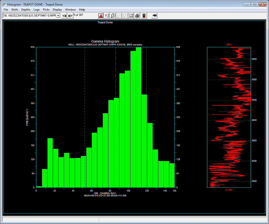
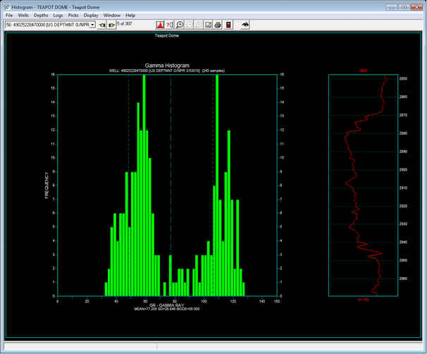
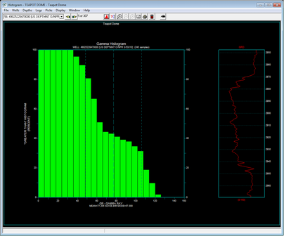
The Log Curve tab controls the basic settings for the histogram plot. Here, add a title for the plot. Next, set the specific curve and scale. The Log Scale button sets the selected axis to a logarithmic scale. By default, Petra displays the curve scale increasing from left to right; the Reverse Curve Display. The Default Scale Range button sets the minimum and maximum scale for the log based on the curves established minimum and maximum scale. The Statistical Scale Range button sets the minimum and maximum scale based on the minimum and maximum data value in the data. The example below plots a histogram of gamma ray curve values, where the GR displayed from 0 to 150 API units. Note that the Use Log Aliases button is selected, so Petra will use the GR curves alias list.
Setting DepthsIts often useful to limit the histograms data points to a specific interval of interest. Data points can be constrained by zone definition, tops, or by a specified depth (MD or TVD). On the menu bar at the top of the screen, select Depths>Set Depths
from the menu bar at the top of the screen. Alternatively, select the
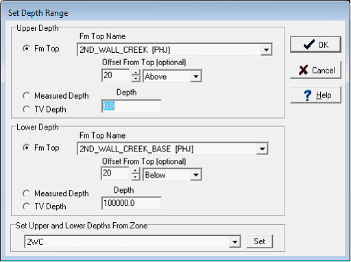
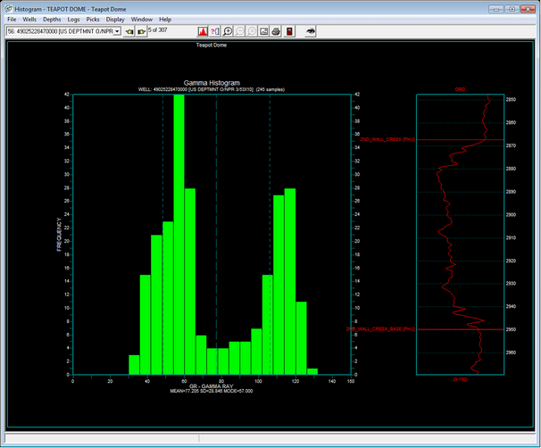
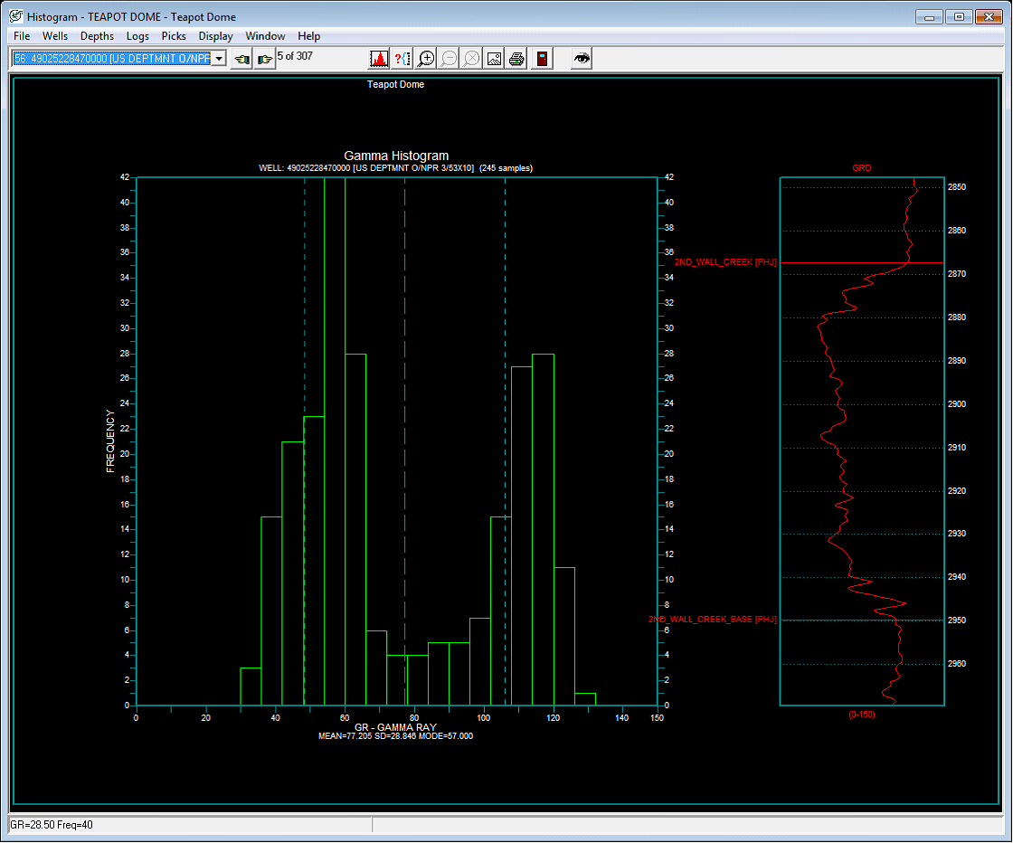
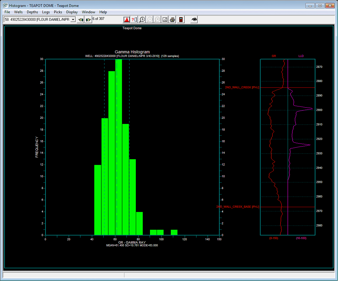
To set depths by a zones interval definitions, select the desired zone on the Select Zone(s) list. Next, select the desired zone. Note that the WELL zone by default covers -1M MD to +1M MD, so it should cover the entire footage of all wells. If the tops used in the zone interval definition are missing for a well, Petra will not display the histogram for that well. To set depths by tops or by a specific depth range, select the Set Depth From Range button. Next, select the Set Range button. In the Set Depth Range box, select the relevant top, MD, or TV Depth button. For MD and TVD, select the relevant button and enter the adjacent depth in the entry field. For tops, select the desired top from the Fm Top Name dropdown box. Notice that an offset can also be added or subtracted to the fm top; this offset will include data points above or below the actual fm top depth. The histogram below is limited only to the area defined by two tops its 20 above the 2ND_WALL_CREEK and 20 below the 2ND_WALL_CREEK_BASE. The histogram is limited to a sand bracketed by shale, so the histogram shows a bimodal distribution of the two distinct lithologies gamma values.
Modifying the HistogramHistogram Cells
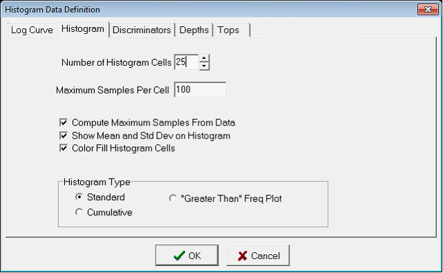
The Number of Histogram Cells varies the number of cells (otherwise known as bins) on Petras histogram. In the example on the left, the histogram uses 25 cells (from 0-150 API units, so each contains a spread of 6 API units). The example on the left, on the other hand, uses 75 cells where each cell is only 2 API units wide. Its worth noting that theres no best number of cells for a histogram; different numbers of cells can reveal different things about the data.
Other OptionsThe Maximum Samples Per Cell and Compute Maximum Samples from Data options on the Histogram tab set the scaling for the vertical frequency axis. The Compute Maximum Samples from Data option automatically sets the vertical frequency scale to the largest frequency value. To change this scaling, deselect the Compute Maximum Samples from Data. The Maximum Samples Per Cell manually sets the upper limit of the frequency plot. The Show Mean and Std Dev on Histogram option calculates the arithmetic mean (or average) plus and minus one standard deviation of the log values. These three lines are displayed as vertical dashed lines on the plot. The actual values for the mean, standard deviation (labeled as SD), and mode are listed on the bottom of the graph. The example on the left has no statistics, while the example below on the right has the mean and standard deviation added.
The Color Fill Histogram Cells option simply fills in the histogram cells; removing this option just leaves outlines for each cell.
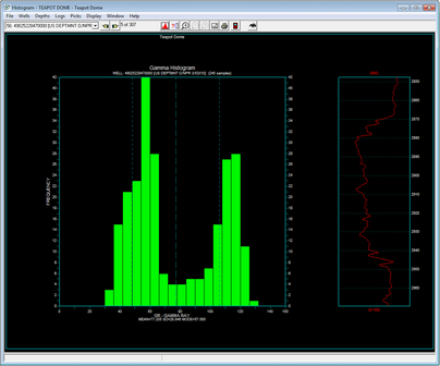
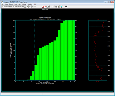
Histogram TypesThe Histogram Types box sets the histograms general plot type: Standard, Cumulative, or Greater Than Freq Plot. The Standard plot displays the total number of values (or frequency) for each cell. The Cumulative plot shows the total number of values for each bin plus all preceding bins. Similar to a Cumulative plot, the Greater Than Freq Plot shows the percentage of values greater than any one bin.
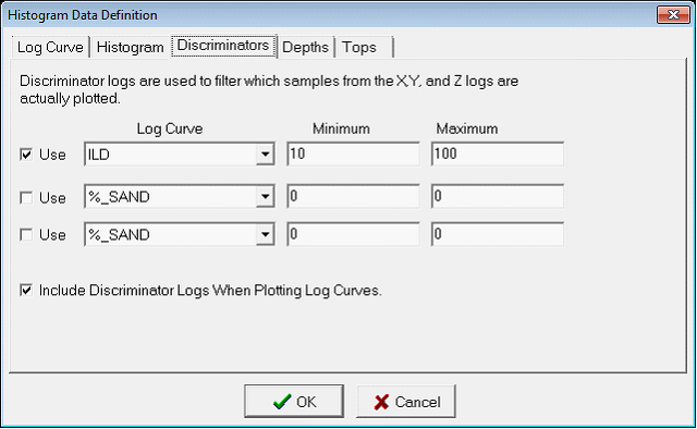
Filtering the Histogram by other Log CurvesDiscriminator curves filter data points by log criteria. To use a discriminator curve, select the desired curve on the dropdowns, and set the scale using the Minimum and Maximum. Data points with values that fall outside of this data criteria are not included on the cross plot. In the example below, only gamma values with an associated resistivity log of 10 to 100 will be included on the histogram. The Include Discriminators Logs When Plotting Log Curves shows the discriminator curve or curves against the log curve on the right.
With a discriminator curve, the histogram shows a much tighter spread of gamma values since these resistivity cutoff excludes the shales above and below the sand. Note how the RILD discriminator curve is displayed to the right of the log curve. Discriminator curve values outside the minimum and maximum scale values will show up as a straight line on the edge of the log window.
Adding Tops to the OffsetThe log curves on the right side of the screen can also show tops, which can help orient the user. First, open the Histogram data Data Definition screen by selecting Logs>Axes and Scales
from the menu bar at the top of the screen or the To add a top, highlight the desired top name in the "Available Tops" list and click the add button (">"). This moves the log over to the Selected Tops list. To remove a top, highlight the top name in the Selected Tops list and click the remove button ("<"). The >> and << buttons add all tops and remove all tops, respectively. To change the color of a top, select the top on the Selected Tops list and select the desired color using the color box on the right. The example below adds the 2ND_WALL_CREEK and 2ND_WALL_CREEK_BASE tops to the display.
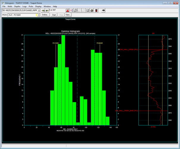
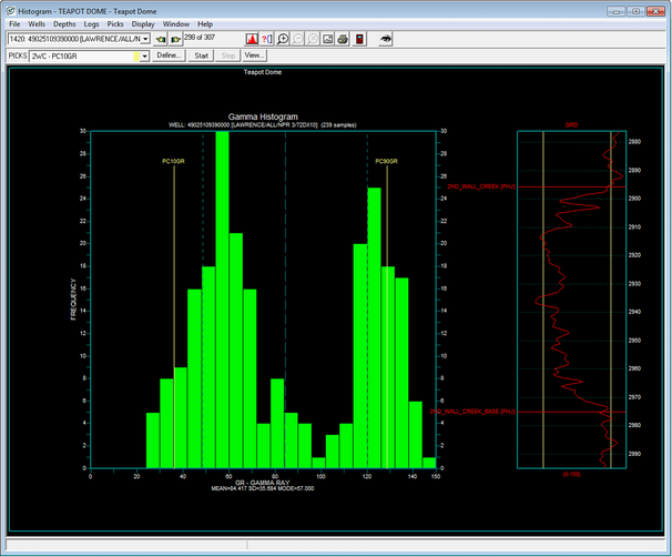
PicksPicks are database-stored curve values. Picks are most commonly used for log curve normalization, such as scaling all gamma ray values in a project to set sand and shale values. Commonly, picks are first created for the entire project from statistical measurements, and the histogram module is used to visually inspect and QC the pick relative to the actual curve. When working with picks, its usually a good idea make sure the CrossHair Cursor option is on. When this option is selected, (Display>CrossHair Cursor on the menu bar at the top of the screen), Petra draws a vertical line on the correlation log that corresponds to the cursors location on the histogram. This can make it significantly easier to see the relationship between the histogram value and the log. Displaying Existing PicksOn the menu bar at the top of the screen, select Picks>Define Picks from the menu bar at the top of the screen. Alternatively, select the The example below shows two picks: PC10GR and PC90GR. Both of these picks these are log statistics created in the Main Module (Compute> From Logs>Statistics ), where PC10GR is the curves 10th percentile, and PC90GR is the curves 90th percentile.
The picks for each well will then be displayed on the histogram. The examples below show two different wells. Since wells are logged with different tools at different times, the picks are slightly different. The well on the left has a smaller difference between the 10th percentile sand and the 90th percentile shales than the well on the left.
Creating New PicksTo create a new data item in the selected zone, select the Modifying PicksTo modify a displayed pick, in the main Histogram Module window select the desired pick from the dropdown on the Picks toolbar, and select the Start button.
Select the new location of the pick on the histogram. As mentioned above, the CrossHair Cursor draws a vertical line on the log to show the histograms value relative to the curve. Left click to set the selected pick. Next, right click to open a set of options. These options include: Next Well, Prev Well, Redraw, End Picking, Delete Picking. Selecting Next Well and Prev Well saves the pick change and scrolls through the wells selected in the Histogram module. Redraw saves the pick change, refreshes the screen to reflect the changes, and leaves the pick tool active. End Picking saves the pick change and deactivates the picking tool, but does not refresh the screen. Delete Pick erases the pick value entirely, leaving a null value in the database for that well. |
 button on the toolbar at the top of the top of the Main Module. This opens the Histogram module. The first time this module is opened, the Histogram Data Definition screen superimposed over the main Histogram Module, which are both blank by default.
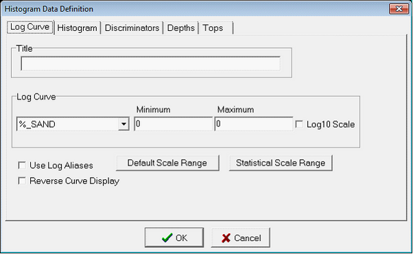

 button on the top toolbar. This opens the Log Curve tab on the Histogram Data Definition window.
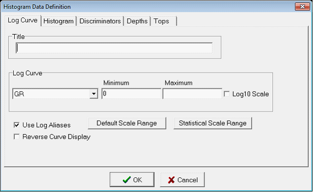
 button on the toolbar at the top of the Histogram Module. This opens the Depths tab on the Histogram Data Definition screen.
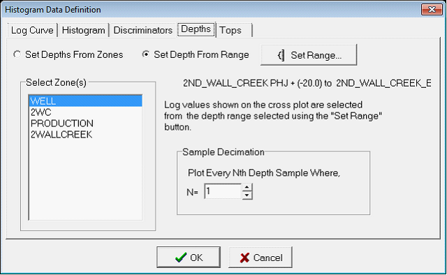


 button on the toolbar. Select the Tops tab.
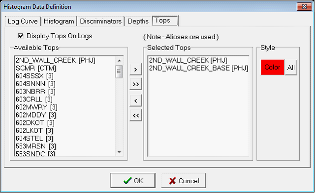
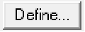 button from the Picks toolbar at the top of the screen. This opens the Define Histogram Picks window. Here, select an existing zone data item with the zone (top) and data item (bottom) in the Available Zone Items box.
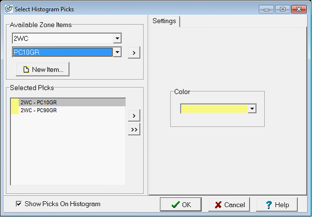
 button in the Define Histogram Picks window. Select the
  button to add the data item to the Selected Picks list in the lower left corner of the window. Note that new zone data items wont have any data, so no picks will immediately appear.