Log Crossplot Data General tab |
|
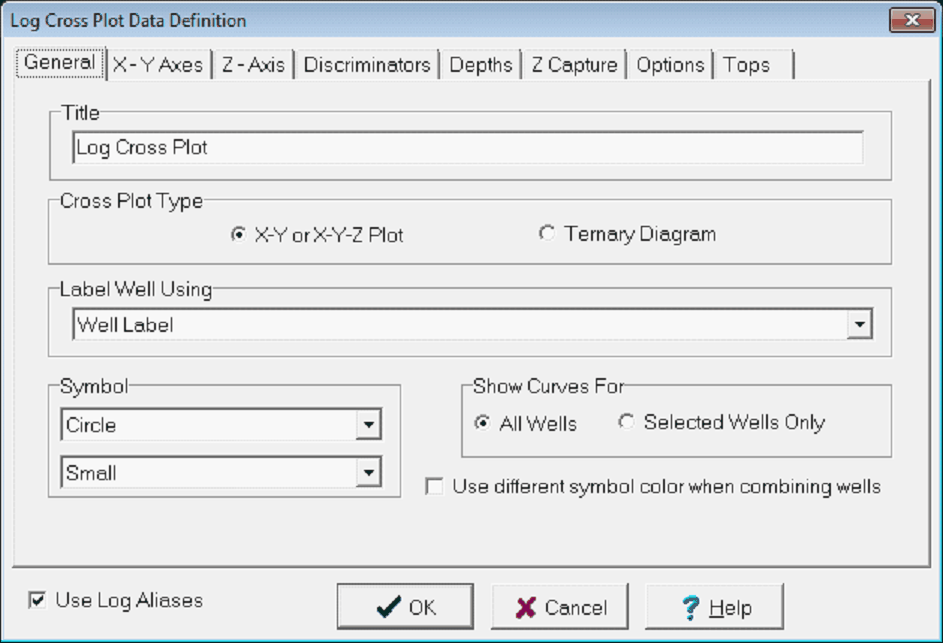
The General tab controls the presentation of the cross plot, including the title, the cross plot type, and labels. The General tab also governs the symbol style for individual data points.
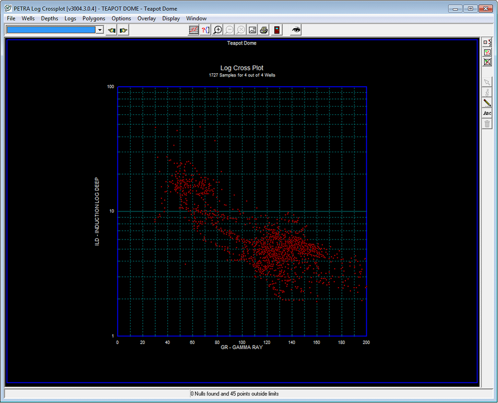
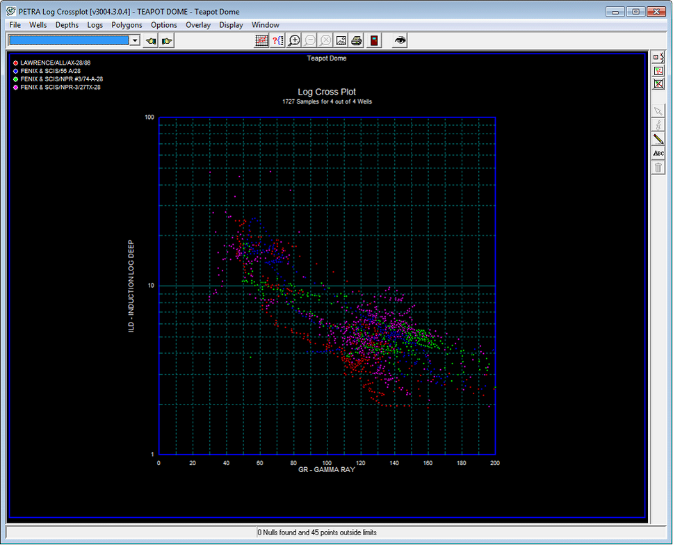
TitleThis box sets the title for the plot. This title will appear at the top of each cross plot display. Cross Plot TypeX-Y and X-Y-Z Plot This option creates a scatter plot with two logs forming the vertical and horizontal axes. Note that this option creates the X Y Axes tab next to the General tab. A third variable (Z) can be shown by color coding the individual data points. Ternary Diagram - This option displays three log values on an equilateral triangle. Ternary diagrams are most commonly used to display ratios between three variables that add up to a constant, such as the relative percentages of shale, sandstone, and limestone that add up to 100%. In Petra, however, the three scales on the diagram are independent, so they dont necessarily need to add up to a constant. Note that this option creates the Ternary tab next to the General tab. A fourth variable (Z) can be shown by color coding the individual data points. Label Well UsingThis dropdown sets how wells are labeled at the top of the plot. Wells can be labeled by UWI, name, number, well label, UWI and name, or well name and number. Symbol These dropdowns set the shape and size of the data points on the plot. By default, data points are red but can be color-coded to reflect an additional curve on the Z Axis tab. Show Curves ForThis option simply filters the available curves on the Ternary and X Y tabs. Selecting All Wells shows curves for all wells in the project, while Selected Wells Only limits the curve selection only to curves available to the currently selected wells. Its generally simpler and faster to keep this setting to Selected Wells Only. Use Different Symbol Color When Combining Wells - Petra can show log data points for a single well, or for multiple wells. This option color codes different wells by different colors. Note that this color coding only uses ten distinct colors; plotting more than ten wells will recycle colors. Deselecting this option will plot all log data points a default red. The examples below show a combination of four wells. The plot on the left shows every data point from every well as red. The plot on the right, however, breaks out the data points from each well in a different color (blue, pink, green, and red).
|