How to Display Digital Logs |
IntroductionDigital logs record wellbore information as it changes with depth. Unlike paper logs, digital logs store log values that are readable by a computer. Though digital logs typically consist of wireline information, they can also include core data, petrophysical model outputs, or anything that has a numerical value associated with a depth. Digital logs are easily stored in Petras database, can be calibrated and used in calculations, and look great in a cross section. This guide uses a standard set of logs to illustrate a wide variety of Petras display styles and features in the cross section module. This guide covers: ·SP Centering & simple colored lines ·Resistivity Logarithmic scaling & cutoff shading ·Neutron and Density Porosity crossover shading ·Gamma Ray GeoColumn shading ·Mudlog Lith summation Adding a New Digital Curve to a Cross SectionAll digital log curves are added and modified in the Log Display Options window. To open this window, in the cross-section module click the Log Display Options button:
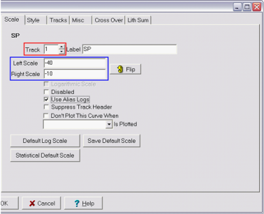
The Available Logs list gives a list of all digital logs that can be added to a cross section. This list can be filtered to include the digital logs from all wells in the project, or just the wells currently selected in the Cross Section Module. To add a log, check the selection box or, double click the log name in the "Available Logs" list. This adds the log to the Selected Logs list. To remove a log, highlight the log name in the Selected Logs list and click the remove button (">") or, uncheck the log from the available list. Once a log is added to the Selected Logs list and is highlighted, the track and display options for that log can be set on the various tabs. SP Simple Line and ColorOnce the log name is on the Selected Logs list, click the curve to highlight it. In this example, the SP curve has been added to Selected Logs list. The next step is to select a depth track, which sets the position of the curve relative to the depth track. Select the depth track for each log by clicking the track up and down arrows (highlighted in red). SP curves usually go to the left of the depth track, so in this example the SP curve goes into Track 1. Next, set the left and right scale (outlined in blue). In this example, the left side of the track will be -40 and the right is -10. Click Use Alias Logs if your project has digital log aliasing.
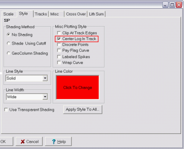
Setting the track (Red) and scales (Blue) for a new SP Curve Go to the Style Tag. SP curves show relative deflection, so select Center in Track (highlighted in red). This puts the curve in the center of the track using the scaling set by the left and right scale. In this example, the left and right scale are 50Mv apart, so the SP curve will be centered with 25 mV on either side. This is great for SP curves, but will cause other logs to plot incorrectly. Here, you can also select color, style, and thickness of the curves line. To set line color, click the Line Color box and select a color. To change line style (dashed or solid) or the width, click the appropriate dropdown box. In this example, the SP curve is red with a wide line width.
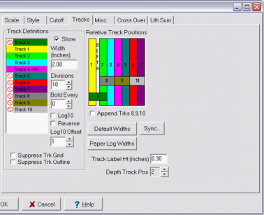
The "Center Log In Track" option only uses the log scales to set the relative amplitude of the curve. This can be useful for SP curves, but is misleading for almost everything else. Finally, set up the log track under the Tracks tab. Hidden tracks dont show a horizontal or vertical grid and are denoted by the Next, set the number of vertical divisions for the track as well as how often these lines will be bold. The track has 10 divisions, and every 5th line will be bold. In other words, the track has 10 vertical scale lines with a bold one in the middle. Since the SP scale is set to represent 50 mV, each vertical line represents 5 mV of SP deflection. After everything is set, click OK at the bottom of the screen to save the settings and display the cross section.
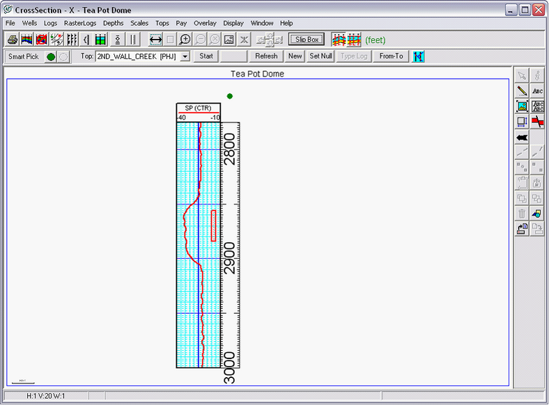
Setting the vertical scale lines for the first track Notice that the log curve header for the SP curve reads SP(CTR). This signifies that the SP curve is centered inside the track. The CTR suffix reminds the reader that the scales only show relative, rather than absolute, changes. Consequently, the curve scales on the header only show the relative scale of deflection.
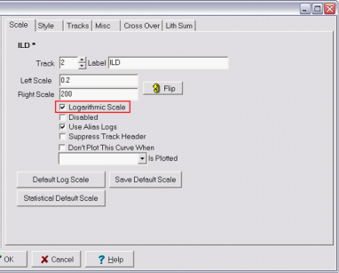
The completed SP curve in the first track Resistivity Curve - Cutoff-based Filling & Log 10 ScalesFilling in a log based on a cutoff criteria is useful for showing when a curve passes a critical threshold. Since resistivity below a certain threshold indicates a wet reservoir, its useful to highlight the curve when its above a certain cutoff line. In this example, resistivity will be highlighted above 10 ohmm. When curves have a large range of values, linear scales tend to show the changes at one magnitude at the expense of displaying changes at another magnitude. Since resistivity curves can cover two or three orders of magnitude, this example will also show how to display these large ranges on a logarithmic scale. First, add the resistivity curve to the Selected Logs list. In this example, its named ILD. Once its on the list, click the curve in the Selected Logs list to highlight it and select the track number. Resistivity curves are usually to the immediate right of the depth track, so set the track to 2. Since these values can vary so greatly, its useful to show resistivity curves on a logarithmic scale. Set the left and right scales and check the Logarithmic Scale box (highlighted in red) below the scale settings. In this example, the scales are set from 0.2 to 200, Click Use Alias Logs if your project uses digital log aliasing.
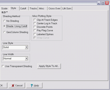
Adding the deep resistivity curve, and setting it to use logarithmic scaling Go to the Style tab. You can set the line style and width here, but for this example the resistivity curve is left as a solid line with normal width. Click on Shade Using Cutoff under the Shading Method box. This creates and immediately opens the Cutoff tab.
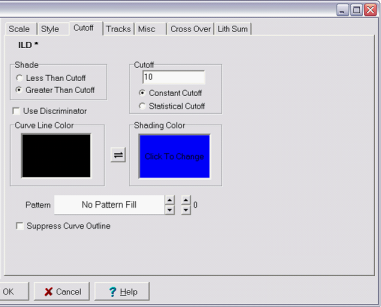
Adding a cutoff-based shading Under the Cutoff tab, you can set the specific parameters of how the curve will be shaded. In this example, the resistivity curve will be shaded whenever resistivity is above 10 ohmm. This helps to quickly distinguish productive intervals from wet intervals. Click on Greater Than Cutoff and set the cutoff value, which in this example is 10. The curve line and curve shading colors are independent and are set by clicking in each color box. In this example, the curve line is black, and the shading underneath that curve will be blue.
Setting the cutoff, line color, and shading. Where the ILD curve is above 10, it will have blue shading. Go to the Tracks tab. Turn on and set up the track by double clicking the Normally the number of divisions sets the number of vertical scale lines in the track. When drawing a logarithmic log, however, the number of divisions needs to be the same as the number of orders of magnitude. In this example, the plot needs to contain 3 divisions ( 2, 20, 200). To draw the logarithmic scale between the divisions, click the Log10 button (highlighted in red). Finally, set the Log 10 Offset (highlighted in blue). The Log 10 Offset scales the logs correctly inside the track. Logarithmic scales from 0.1 to 100 use a Log10 Offset of 1, and scales from 0.2 to 200 use an offset of 2. After everything is set, hit OK at the bottom of the screen to draw the cross section.
Turning on track 2. Since the resistivity curve uses logarithmic scales, the "Log10" option is on. Since the scale is from 0.2 to 200, the "Log10 Offset" option is set to 2 Logarithmic scales require the left and right track scales, the divisions, and the Log10 offset to all agree. With the number of settings, these scales can be tricky and it is not immediately obvious when something is wrong. Even if you dont plan on using cutoff shading for interpretation or presentations, its usually a good idea to use it in the beginning as an easy way to check the scaling and display of logarithmic logs. If the cutoff shading starts at the correct division on the plot, everything is set up properly. If not, then the divisions, scaling, or Log10 offset need to be adjusted. In the example below, the shading starts at 10 ohmm, so the settings are correct.
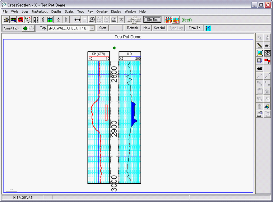
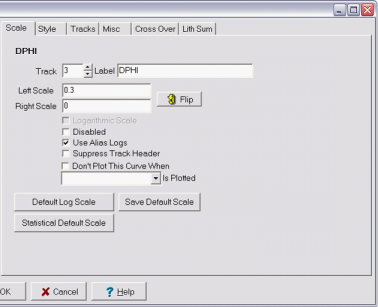
The completed ILD curve in the second track Neutron and Density Curves - Crossover ShadingCrossover shading is useful for coloring the space between two log curves. In some reservoirs, the gas effect on porosity logs causes neutron porosity to read too tight and density porosity to calculate too porous. Shading the area between the two porosity logs is useful for discerning the total footage of crossover, as well as the relative magnitude. In this example, the neutron porosity and density porosity are named NPHI and DPHI, respectively. Add the two curves to the Selected Logs list and put them into Track 3 to the right of the resistivity curve. Remember that Petra handles each log independently, so youll have to set the track for each well. Set each logs scale, as well. In this example, both the left and right track edges are set to 0.3 and 0 to cover 30% to 0% porosity. Percentages can be stored as both 0-100 and 0-1. Be sure to set the scales here according to your logs scaling convention. Click Use Alias Logs if your project has digital log aliasing.
Adding the NPHI and DPHI curves Next, go to the Style tab. Since Petra handles each curve individually, well look at the Style tab for the neutron and density porosity logs one at a time. First, click the neutron porosity log in the Selected Logs window. In this example, the neutron porosity logs line color is set to red in order to distinguish it from the density porosity.
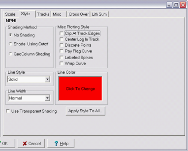
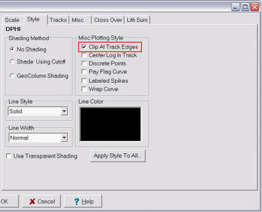
Setting the NPHI curve to use a red line color Next, click on the density porosity log on the Selected Logs window. Hole washouts cause the density tool to read anomalously low density, which results in high calculated porosity values reading well above 30%. To clip these bad values, under the Misc Plotting Style box, select Clip at Track Edges (highlighted in red).
Trimming bad density porosity values with the "Clip At Track Edges" option Next, go to the Tracks tab. Turn on Track 3 by double clicking the Track settings are independent of logs. Since both the neutron and density logs are in the same track, these changes just need to be made once.
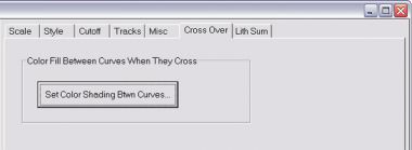
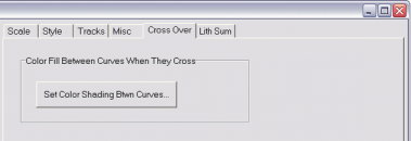
Setting the divisions for the NPHI and DPHI log track To set up crossover shading between the neutron and density porosity curves: 1.Go to the Cross Over tab 2.Click the button reading Set Color Shading Btwn Curves
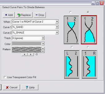
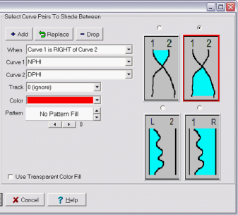
Setting up Color Shading This brings up the Shade Between Logs window. You can also get to this window anytime through Logs>Shade Crossover (Btwn Log Curves) on the menu bar at the top of the Cross Section Module. To fill in the space between two logs, first select the two curves for crossover shading in the Curve 1 and Curve 2 dropdown boxes. In this example, Curve 1 and 2 are NPHI and DPHI, respectively. Next, select the proper shading method. In this case, the area where neutron porosity reads to the RIGHT of density porosity should be shaded. Click +Add to bring the curves to the Shaded Curve Pairs list on the far left side of the screen and hit the OK button on the bottom of the screen. If you make changes be sure to click Replace to update a specific log pair. Crossover shading does not require the two curves to be at the same scale. Crossover shading simply fills in the area between the two curves as drawn on the track.
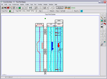
Setting the crossover shading The two porosity curves should now appear on the cross section. The area between the two porosity curves is shaded red. Notice that the washouts on the density curve are clipped at the edge of the track.
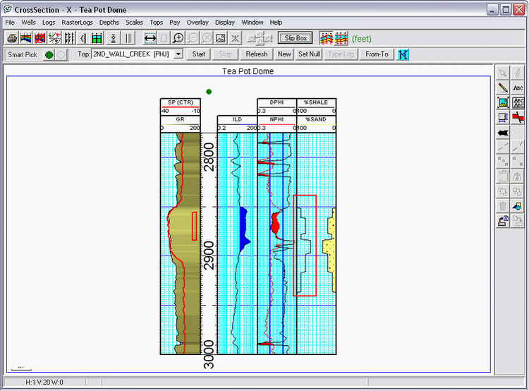
The DPHI and NPHI curves now have shading to illustrate the gas crossover effect Gamma Ray - GeoColumn ShadingGeoColumn shading colors the area between a curve and the track edge with variable color based on log curve values. The color shading under the curve can either be from the same curve or from an entirely different log. Shading a gamma ray log with the same gamma ray values better displays the finer variations between sandy and shaly sections. First, add the curve to the selected logs list, put it in the appropriate track, and set the scales. In this example, the GR curve will go in track 1 with the scales set from 0 to 200. GeoColumn shading can cover up a fair amount of the track, so its a good idea to use the Up arrow (highlighted in red) to move the GeoColumn curve to the top of the list. When Petra draws multiple things in the same space, items at the top of the list are drawn first - and consequently underneath the rest of the items on the list. In this case, the SP curve and the GeoColumn shaded GR curve will be in the same track. Plotting GR first will prevent the SP curve from being covered up. Click Use Alias Logs if your project has digital log aliasing.
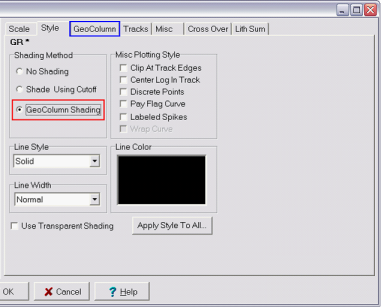
Adding the GR curve, and moving it to the top of the Selected Logs List (Red) Next, go to the Style tab. Under the Shading Method box, select GeoGolumn Shading (highlighted in red). This creates a new tab for GeoColumn shading (highlighted in blue).
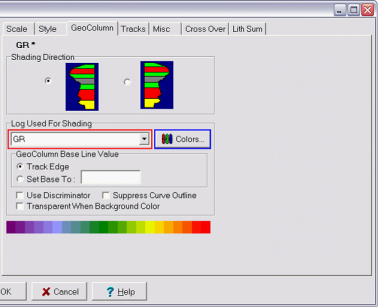
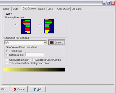
Turning on GeoColumn shading for the GR curve Go to the GeoColumn tab. First, select the log used for shading from the dropdown menu (highlighted in red). This is the curve that determines the color fill underneath the GR log. In this example, the gamma ray curve will have shading that reflects the same gamma ray values. Varying the color underneath the GR curve will better show small variations in sand and shale content. As mentioned above, its also possible to shade a curve using a different log for instance, it might be useful to shade the GR curve with PE values to show differences in lithology. The next step is to set the color scheme for the shading underneath the curve. Petra has a default rainbow color scheme, but a different color scheme will represent the data better. Click the Colors button (highlighted in blue).
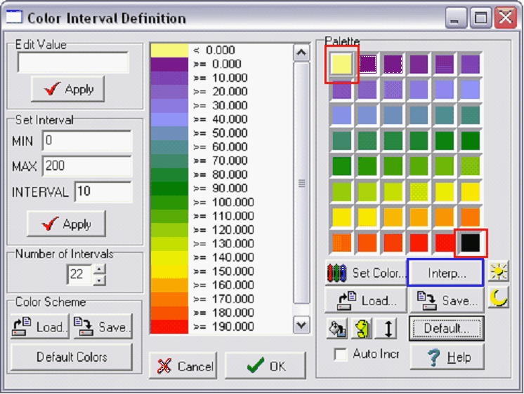
The geocolumn shading will use the GR curve for the coloring underneath the curve Set the minimum and maximum values for the Color bar in the MIN and MAX boxes, with the interval between the bars set at INTERVAL. Press the Apply button to make the changes to the definition. In this example, the Color bar scale is set to a MIN of 0 and MAX of 200, with an interval of 10. Next, set the color scale. In this example, the difference between high and low gamma reflects sand content. Its useful to represent this variation with a color bar showing sand as yellow and shale as black. To set the color bar with a yellow to black scale, in the color palette double click on the upper-left color box (highlighted in red) and set the color to yellow. Double click the lower right color box (highlighted in red) and set the color to black. These two boxes set the colors for the upper and lower values of the Color bar. Next, click Interp (highlighted in blue) to interpolate between these two colors and fill the Color bar.
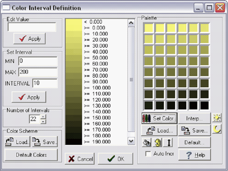
The Interp button (blue) interpolates colors between the upper left and lower right corners (Red) of the color palette The Color bar now scales from 0 as a pale yellow to 200 as black, which approximates the difference between a low gamma ray count for a sand and a high count for a hot shale. Click OK to accept the Color bar settings.
A good color scheme for highlighting sand-shale differences in a gamma ray curve Once the Color bar is set, the GeoColumn tab should reflect the changes. There is no need to change any settings under the Tracks tab since the settings will be the same as those established with the SP curve. Click OK to finish and draw the log.
A completed GeoColumn tab The GeoColumn shading now shows subtle variations in gamma ray character. Notice how it is plotted below the SP curve.
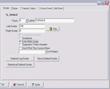
The GR curve with GeoColumn shading that varies based on the value of the GR curve Mudlogs - Lith SummationLith summaries are useful for displaying cumulative data. Most often, this is lithology percentages measured from mudlog samples. If a sample has 70% shale and 30% sandstone, its generally more useful to represent these two numbers as a cumulative plot adding up to 100 instead of two separate curves at 30 and 70. This same technique can be used to represent any combined values that represent a percentage of a whole. This includes flow data from production logs, mineralogical breakdowns from spectral gamma ray logs, or fluid-filled porosities from MRI logs. In this example, mudlog sand and shale percentages are recorded as %_Shale and %_Sand logs. To create a LithSum, place the logs into a track and set the scale. In this example, the sand and shale percentages are set to track 4, which is to the right of the porosity logs. Additionally, the left and right scales of are set to 100 and 0%. Click Use Alias Logs if your project has digital log aliasing.
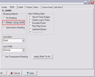
Adding sand and shale percentage curves. Note that both are in the 4th track. In this example, the sand percentage will be on the far right. Its easiest to fill the first curve in with cutoff shading. In this example, the first curve on the right is the %_Sand curve. Click on the curve to highlight it, and select the Shade Using Cutoff option. This creates and brings up the Cutoff tab.
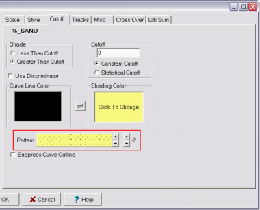
Turning on Cutoff shading for the %_Sand curve Shading the first curve of a LithSum set is very similar to setting the shading on the resistivity curve discussed above. In this example, the shading is set to yellow whenever the curve is greater than 0. This will fill in all the area covered by the sandstone percentage. Its also possible to add a sandstone pattern to the fill by using the scroll windows next to the pattern box (highlighted in red). The left set of up and down arrows changes the pattern, while the right set of arrows changes the scaling or density of the pattern.
Adding a sandy color and pattern for the %_Sand curve Next, set up and turn on the track by double-clicking the
Turning on the 4th track, and setting the divisions to reflect 10% increments If we click OK and plot now, the sand percentage is filled in but the shale percentage is displayed as a regular log. In other words, 70% shale content is displayed as 70 on the scale bar (highlighted in red in the example below). This is misleading since it suggests 30% sand and 40% shale instead of the two parts adding up to 100%. The shale fraction and the sand fraction need to be summed in order to accurately reflect the data.
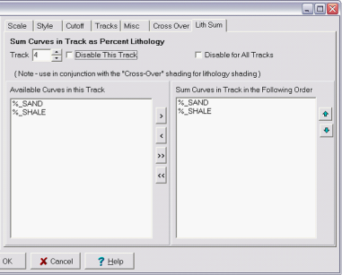
Displaying the %_Sand and %_Shale curves as regular curves without LithSum. To set up Lith Sum, go back to the Log Display Options screen. Select one of the curves to be added together in a track and go to the Lith Sum tab. While in the Lith Sum tab, select the logs from the Available Curves in this Track window, and click the > to add them to the Sum Curves in Track in the Following Order window. In this example, the sand and shale percentages are moved over into the Sum Curves window Next, use the up and down arrows to set the curves in the order they should be summed. The order should be the same as the order the curves appear on the scale from low to high. In this example, %_Sand is on the low end of the scale from 0-100, so it should go first. This will sum the two logs together to reflect a cumulative value.
Setting up the LithSum in the 4th track. The last step is to shade between the shale and sand lines. Go to the Cross Over tab and select Set Color Shading Btwn Curves
Setting up shading between the %_Sand and %_Shale curves Select the two curves for crossover shading in the dropdown boxes for Curve 1 and Curve 2. In this example %_Sand is curve 1, and %_Shale is curve 2. Next, select the proper shading method. In this case, the area where Sand_% reads to the RIGHT (below) of Shale_% should be selected. Finally, select a color and a pattern. In this example the area between the sand and shale percentages should reflect shale, so grey with a standard shale pattern is selected. Click +Add to bring the curves to the Shaded Curve Pairs list on the far left side of the screen and hit the OK button on the bottom of the screen. Click OK again on the Log Display Options window to keep your changes and draw the cross section.
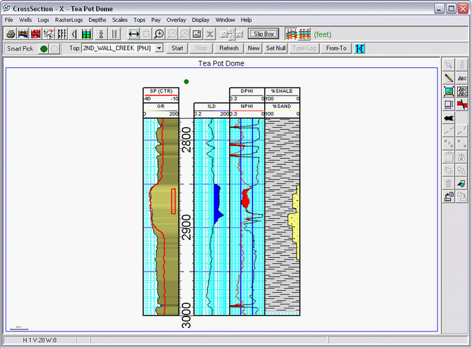
Setting the crossover shading Mudlog data is now displayed on the cross-section in a meaningful way. At a glance, its easy to determine the relative percentages of shale and sand relative to the openhole logs.
The completed Lith Sum shading for the sand and shale percentage curves |
 , or go to
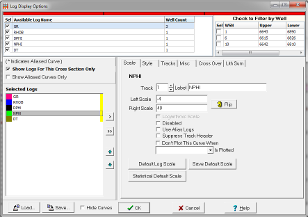
 symbol to the left. Double clicking each track name under the Track Definitions box toggles the depth track on and off. Click inside the Width box to set each tracks width. In this example, the track is 2 inches wide.
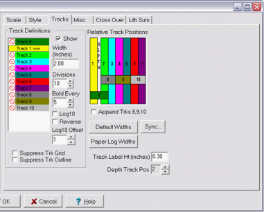
 symbol next to Track 2 under Track Definitions. Also establish the width of the track. In the example below, the width is 2 inches.
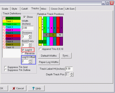
 symbol under Track Definitions and set the width. In this example, the width is 2 inches. Set the divisions to show a useful number of vertical scale lines. In this example, there are 30 divisions with 3 bold lines.
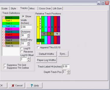
 symbol to the left of the name in the Track Definitions box. The mudlog in the example is set to track 4, and is 2 inches wide.