Log Crossplot Data Z Axis tab |
|
The Z-Axis tab color codes data points by an additional third log curve, giving a third Z dimension to the scatter or ternary diagram.
Use Z Axis logThis option simply toggles the selected Z-axis coloring. When toggled on, data points will use the Z-axis colors. When toggled off, Petra just uses the default color for data points, but retains all the color and curve settings for the Z axis. Use Z-Axis Colors When Combining Wells This option overrides the Use different symbol color when combining wells option on the General tab. This section sets the curve and Color bar for the data points. Select the desired curve on the dropdown, and set the scale using the Color Range button.
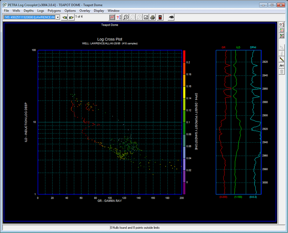
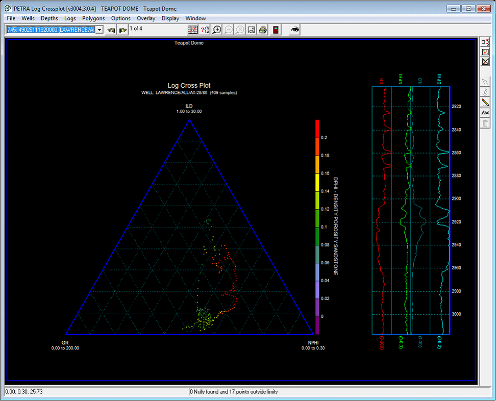
Here, set the minimum and maximum values for the contours in the MIN and MAX boxes. The Interval sets the contour interval between colors. There can be up to 47 different intervals. Petra comes with several other color schemes available through the Default button on the right side of the screen. The example above uses rainbow.zpl. To create a new color scheme, select an individual interval and select a color from the palette for that interval. The two examples below demonstrate how Z data can add an additional dimension to log cross plots. The first example colors a gamma and deep resistivity cross plot by density porosity values. Cool sandy data points tend to correlate with higher porosity, with the notable exception of an island of high resistivity tight streak in the upper left corner of the plot. The second example shows a gamma ray, resistivity, and neutron porosity ternary cross plot with data points colored by density porosity. This plot reaches similar conclusions as the first, with the added conclusion that neutron porosity and density porosity are closely related.
|