Z Cross Plot Data Definition Z-Axis |
|
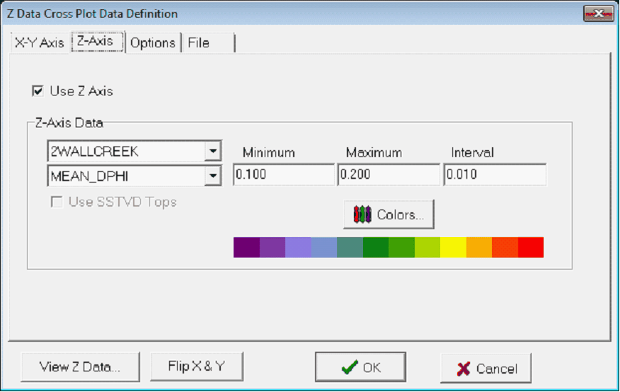
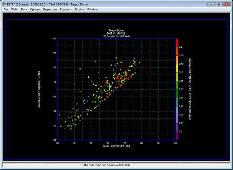
The Z-Axis tab color codes data points by an additional Z data value, giving an additional dimension to the XY scatter plot. Data points that do not have a Z value will not be plotted.
The Z Data Cross Plot Data Definition Z-Axis tab (left) and a color-coded cross plot (left) Use Z-Axis - This option enables Z-Axis color coding.
Z Axis DataThis section sets the specific zone and data item, for the Z axis color coding. The upper dropdown select the zone, and the lower dropdown selects the data item. Minimum (left) - This entry sets the minimum value for the cross plot. Maximum (right) - This entry sets the maximum value for the cross plot. The normal Color bar is Petras default way of selecting the colors for a grid. This system gives greater flexibility in changing colors and irregularly spaced intervals, but tends to be a little more work to set up and has a more limited total number of intervals.
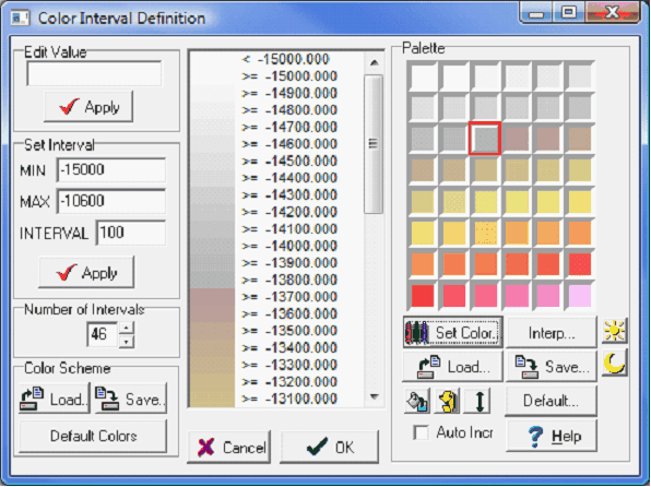
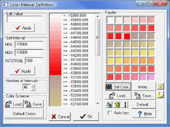
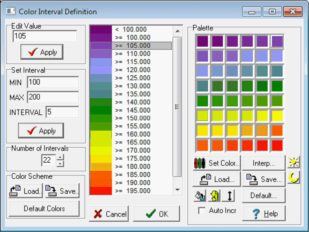
The Color Interval Definition Window
Edit ValueEach selection of the interval list box displays the interval "z" value in the Edit Value entry field. Use the Apply button to modify the z value. Intervals need not be a constant increment, however, z values must increase from top to bottom.
Set IntervalMin - This option sets the maximum contour. Grid values below this minimum won't appear on the contours. Max - This option sets the maximum contour. Grid values above this maximum won't appear on the contours. Interval - This option sets the desired contour interval. Apply - This button creates intervals from the minimum to maximum.
Number of Intervals This option displays and modifies the total number of intervals on the interval list. The normal Color bar can handle a total of 46 different intervals, starting with the minimum and counting up towards the maximum. Decreasing intervals will drop the highest intervals first. Similarly, adding additional intervals will add add intervals above the maximum.
Color SchemeLoad... - This button loads a previously saved set of intervals and colors. Save... - This button saves the current set of intervals and Color bar to a *.ZPL file. Default Colors - This button resets the color palette and intervals to the grid defaults.
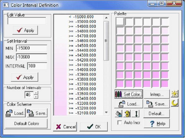
Palette
Changing An Interval Color - To change the color for a particular interval, select the interval by clicking the left mouse button on the list box in the center of the screen. The interval color will be highlighted in the color palette. Click the left mouse button on any color palette color cell to change the interval's color. Set Colors... - This button changes the the selected palette's color. Alternatively, doubleclick the palette color The system color selection dialog is activated for changing the cell's color. The system color dialog can also be used to define several additional customized colors. Use Interp - This button will interpolate the entire palette starting with the upper left corner and ending with the lower right corner. If you want to interpolate between two specific cells, click the starting cell then hold down the CONTROL KEY and click the ending cell. All intermediate cells will be interpolated. Load... - This button loads a previously saved customized color palette. Save... - This button saves the current color palette to a *.ZPL file.
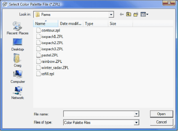
Default - This option selects one of Petra "default" Color bars. By default, these ZPL files are stored in C:\geoplus1\Parms.
Selecting a "Default" Color bar
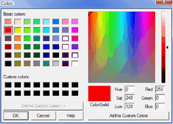
Auto Incr - This option advances the interval list box item following color selection for a particular interval. Use this feature to quickly set the colors for all items in the interval list box. Simply select the first numeric interval and begin selecting colors from the palette. Each click of the palette sets the color for the current interval and advances to the next interval. Continue until all interval colors are selected. Changing Colors on a Normal Color bar WalkthroughChanging the palette on the right side of the screen directly changes the colors used on the Color bar. To change a color on the palette, double click inside any color box to bring up a color tool. This screen has a set of basic colors, though you can use any color by selecting the color box on the right, or enter values using Hue/Saturation/Lightness or Red/Blue/Green.
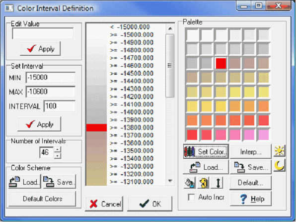
Changing a palette color (Left), selecting red on the color screen (Right)
The palette color changed to red Filling an entire palette by selecting individual colors is slow and creates blocky color transitions. Interpolating between colors in different palette cells is easier and leads to smoother transitions. Interpolation proceeds from upper left to lower right. To interpolate between two specific cells, click the starting cell then hold down the CTRL key and click the ending cell. All intermediate cells will be interpolated. In the example below, the interpolation is from the white cell in the upper left corner to the red cell created in the example above. Repeat the process with different cells to create a smooth transition between several different colors.
Interpolating between colors with the CTRL key. Before (Left) and after (Right)
For a single color Color bar, set the upper left and lower right colors to the starting and ending colors. Next, select the Interp... button to interpolate the entire palette starting with the upper left corner and ending with the lower right corner. In the example below, the upper left color is white, and the lower right color is pink. Using the Interp button interpolates between white and pink, as shown in the example below.
Using the "Interp..." button. Before (Left) and after (Right)
|

 - The "Flip Colors" button inverts the colors in the internal list box from top to bottom.
 - The "Stretch Fill With Palette" button will fill the color scheme starting with the upper left-most palette color. The entire palette will be "stretched" over the color interval range.